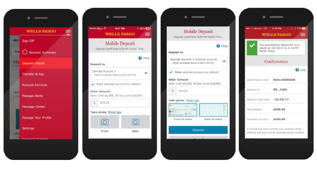
Wells Fargo - Mobile Deposit 2019
PROBLEM: Payments Team had an issue with Mobile Deposits flow on the Wells Fargo Application. There was a high drop-off rate in the flow while their customers were in the process of depositing checks digitally.
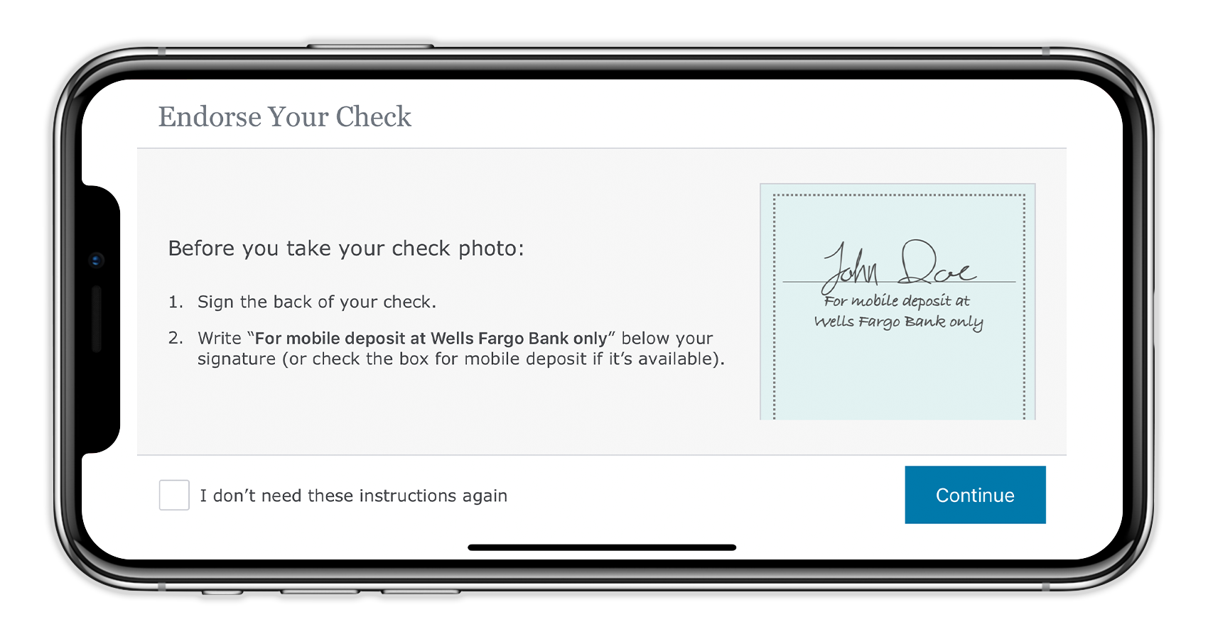
RESEARCH: We held a day of user research where current Wells Fargo customers came into the office to go through the process of depositing checks on a mobile device. The drop-off point was that customers did not endorse their checks with “For Wells Fargo mobile deposit only” beneath their signatures.
SOLUTION: Our team created a simple solution of inserting an additional step between the process of taking photos of the front and back of the check with this full screen overlay to remind customers to specifically endorse their check. Customers that are aware of this notice were able to remove the reminder.
RESULTS: After this product update was launched, there was little to no drop-offs when it came to endorsed checks.
TAKE AWAYS: I had the opportunity to back-fill for another designer as I was part of the Communications Team. This gave me the opportunity to work in a different team with other departments. Also one of the patterns I have created for a previous project is utilized across the board at Wells Fargo; the number pad.


