
SugarWOD 2020
I am an avid CrossFitter. My life is 50/50 working on design while I work/train at the gym. One of the tools we use most often is SugarWOD. We chose this app for our programming because it's interactive for our members. The social aspect of the app where you can give athletes fist-bumps and comment on their scores to acknowledge their achievements is great for our community. The app is great, it's easy to use, but me being a designer, I have a tendency to notice little things that I would update.
(This is a WIP so check in for updates!)
On the app currently, the hero image on the Whiteboard page* is super tall and pushes all the content down, which is what I believe a lot of athletes are trying to get to. I think the image is nice to give the page some color and personality (admins can upload their own photos for their gym). In my mockup I’ve reduced the size of the image by half so that more of the content is visible above the fold. Creating a rule so images will be cropped or resized would give the content more visibility.
*The Whiteboard page is where the day’s workout is posted, it’s in chronological order by how the CrossFit class is structured: warm up, mobility/stretching, strength, and followed by a workout that can last anywhere from 7-30 minutes
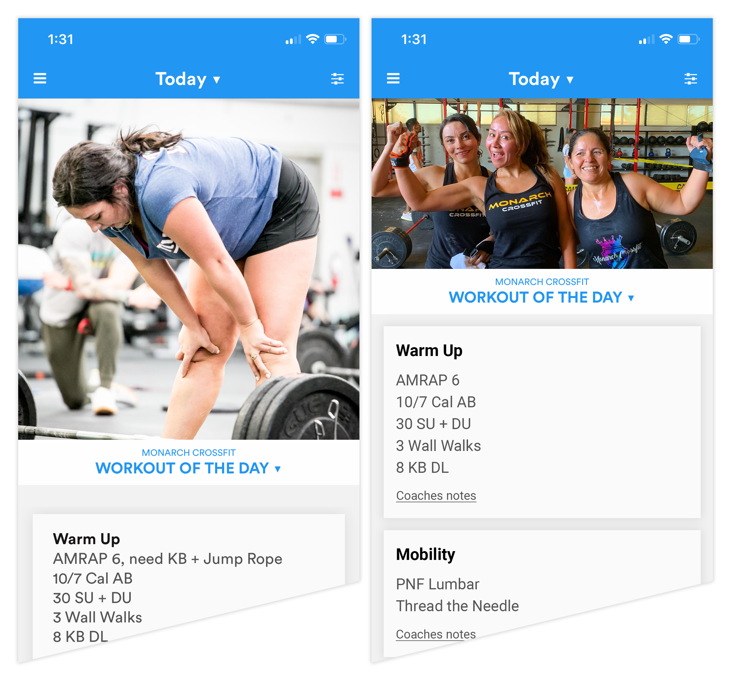
Left: Original Right: My mockup
Left: Original Right: My mockup
The Whiteboard page is very long because it lists out each section of the class.
I see athletes constantly scrolling to get to what they want — it can take a minute! Being able to truncate each widget with a carrot drop-down can shorten the length of the sections.
Also reducing the size of the links and buttons could give it a more balanced and complete look
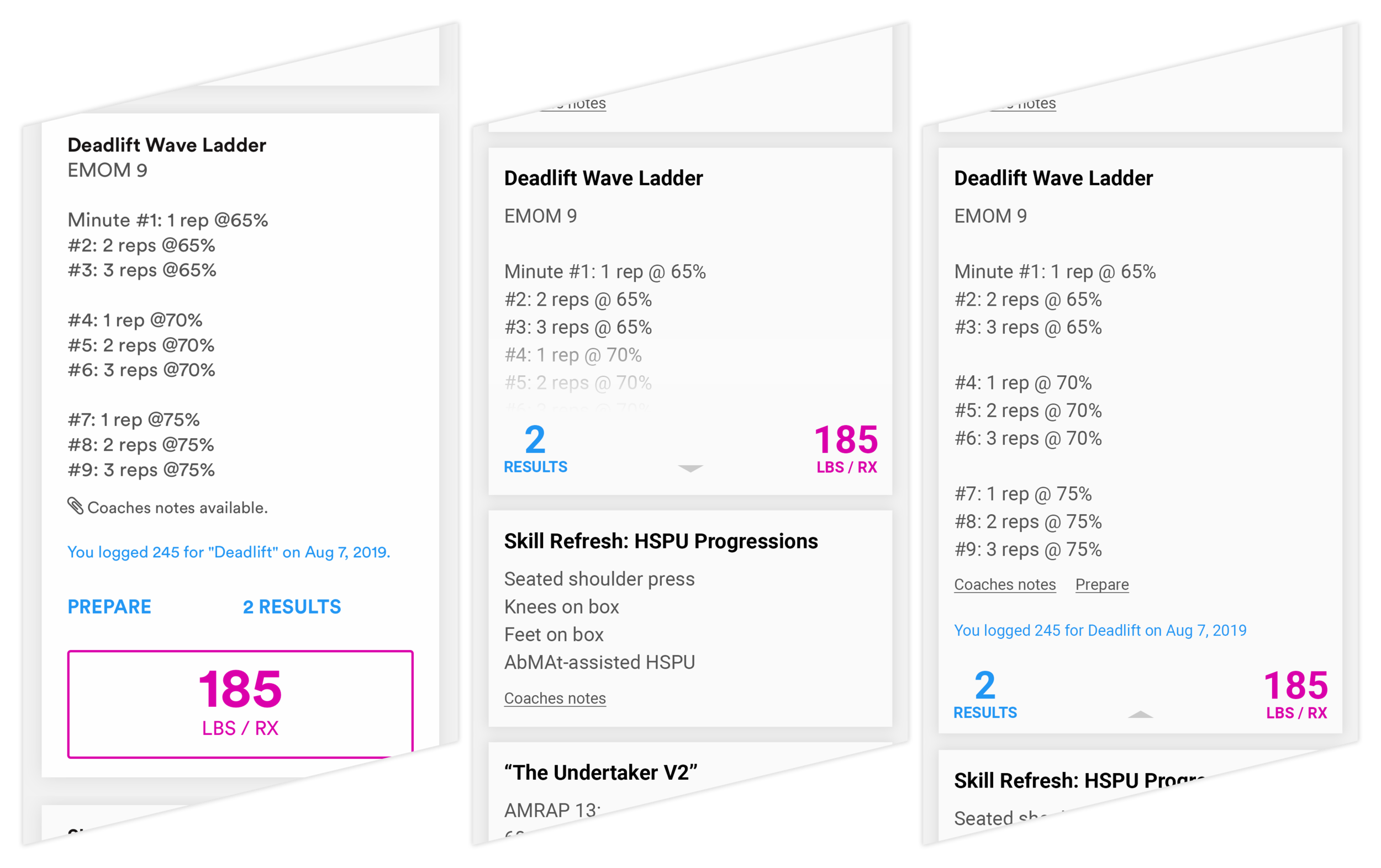
When submitting your numbers for your workout, it’s usually how many pounds a lift was, or what your finishing time was on a circuit.
You would also include information whether you were able to do it RX (basically means you were able to do the complete workout as it was prescribed) or if it was Scaled (where you had to modify some movements because either the weight was over your limit or the movement was beyond your flexibility).
In this app, you can also jot a note about the workout to remind you of the pain you went through (and your friends can comment on it!)
On the Scorecard there are elements that aren’t spaced or aligned evenly (I get really tripped up about little details like that), I just wanted to clean it up and simplify it a lil’ bit.

Left: Original Right: My mockup